Matching Paint to Furniture Colours: A Quick Guide.
Colour is important, it influences our emotions, behaviour and even mental performance. Colour psychology is the study of how different hues influence mood and feelings, and how different colour can stimulate brain processes. But while there are measurable similarities in individuals response to certain colours, it is also a deeply personal thing, as it our perception of different hues is shaped by our personal tastes and experiences, linking them to different emotions and memories.
We spend a great deal of time within our own homes, and specifically in our bedrooms. These are our own spaces, and as such are incredibly important, and they have a huge effect on our mood and emotions. We always encourage the personalization of personal spaces, as it can greatly improve mental health.
How to Start:
Choosing a colour for your walls can seem to be an unnecessary, stressful and overwhelming thing to do but there are a few steps that can simplify and make the process easier. And never underestimate just how much a feature wall or even just a simple coat of paint can completely lift a space from dull to beautiful.
First: Define the mood and aesthetic you want to go for, find inspiration and decide what direction you want to go in. Do you want warm, friendly vibes or a more moody, sophisticated look? Everyone is different and finds different things appealing, don’t get caught up in the current trends, find what makes you happy and remember, it’s not irreversible, if you don’t like it, it’s not impossible to change.
While everyone has a different reactions depending upon their own tastes and personal preferences there are a few measured and studied differences that colour has on the majority of the population.
Common Reactions to colours:
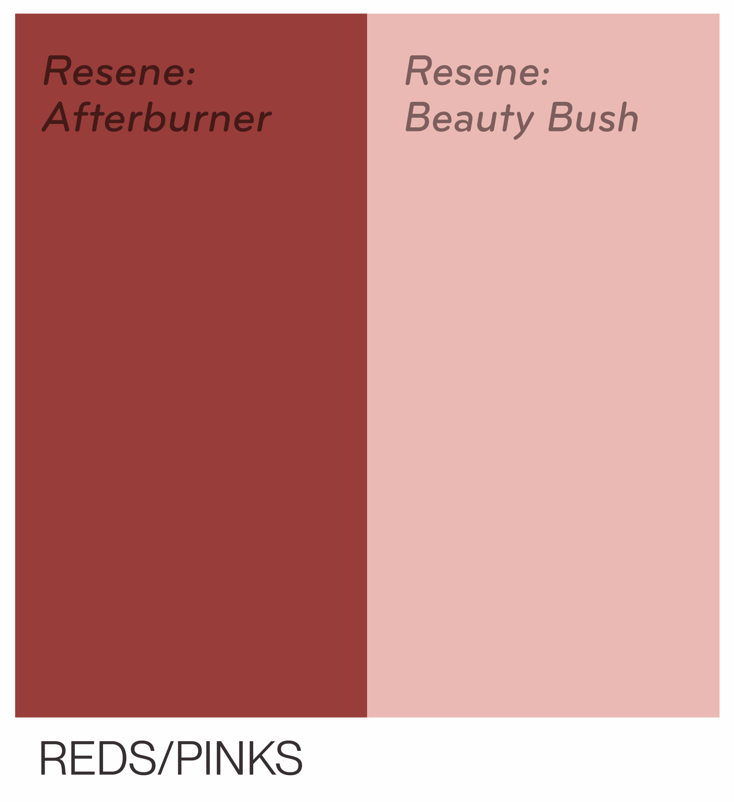
Red and by extension pink, is considered a deeply stimulating colour, connected to more heated emotions like anger, but also love and inspiration. It grabs attention immediately and has been shown to improve ability to encode and understand information.
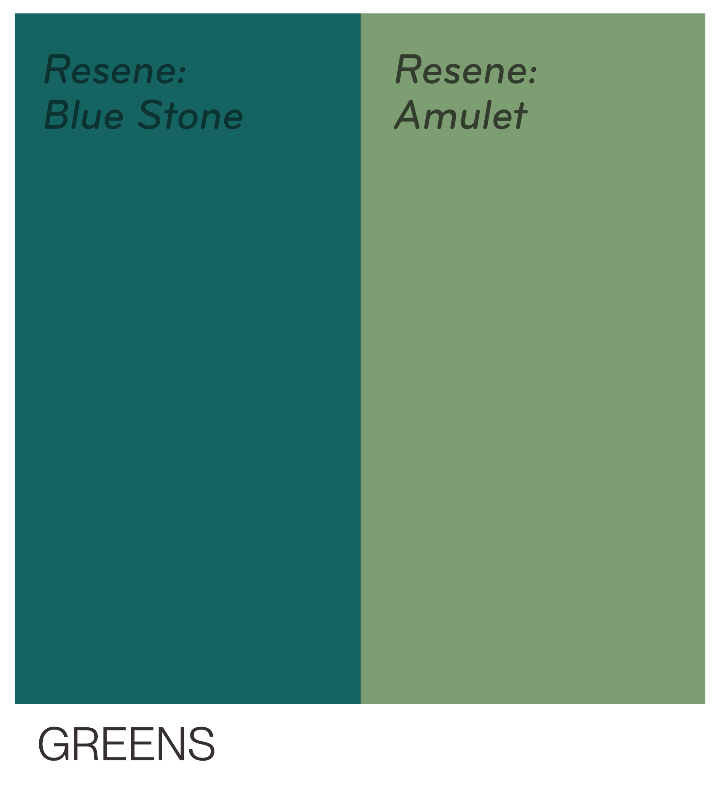
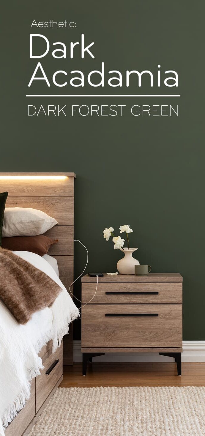
Green is the most common colour in nature – it’s everywhere and is the most widely differentiating colour due to its place in the middle of the wavelengths that our eyes can receive, deep forest greens are more mysterious and calm, while brighter, more vibrant yellow-greens are more energetic and open.
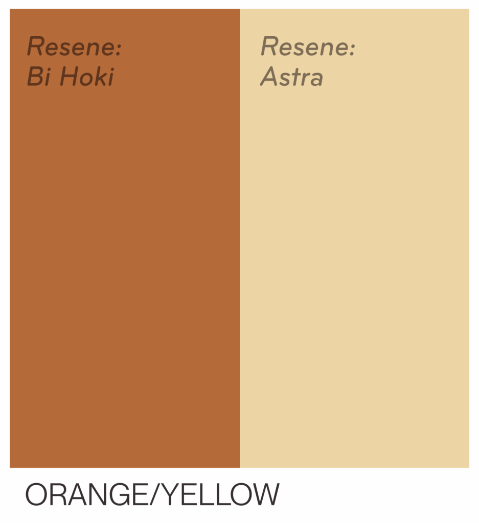
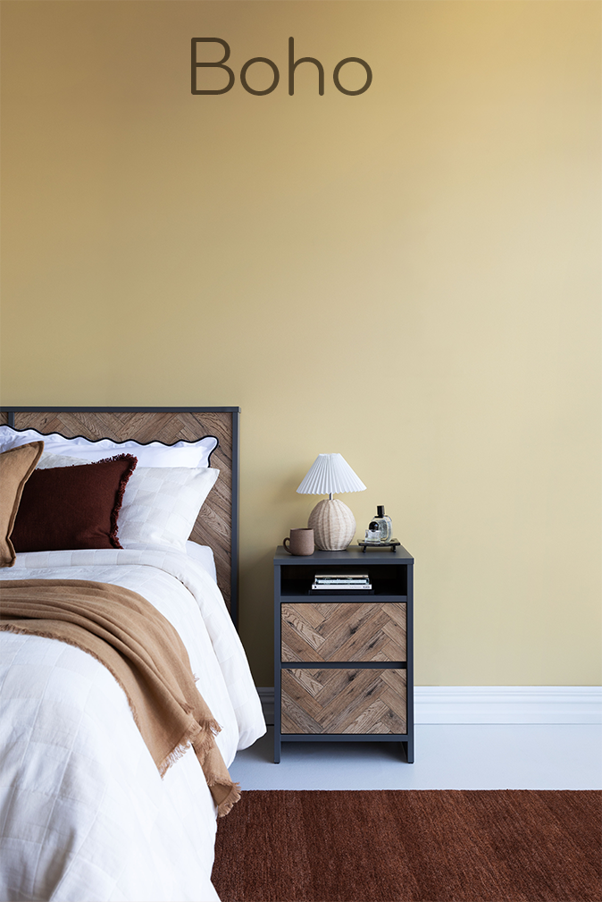
Oranges and yellows have similar effects, but are more related to sunshine, brightness, summer and happiness. We are naturally primed to connect yellow with the outdoors, nature, and sunshine.
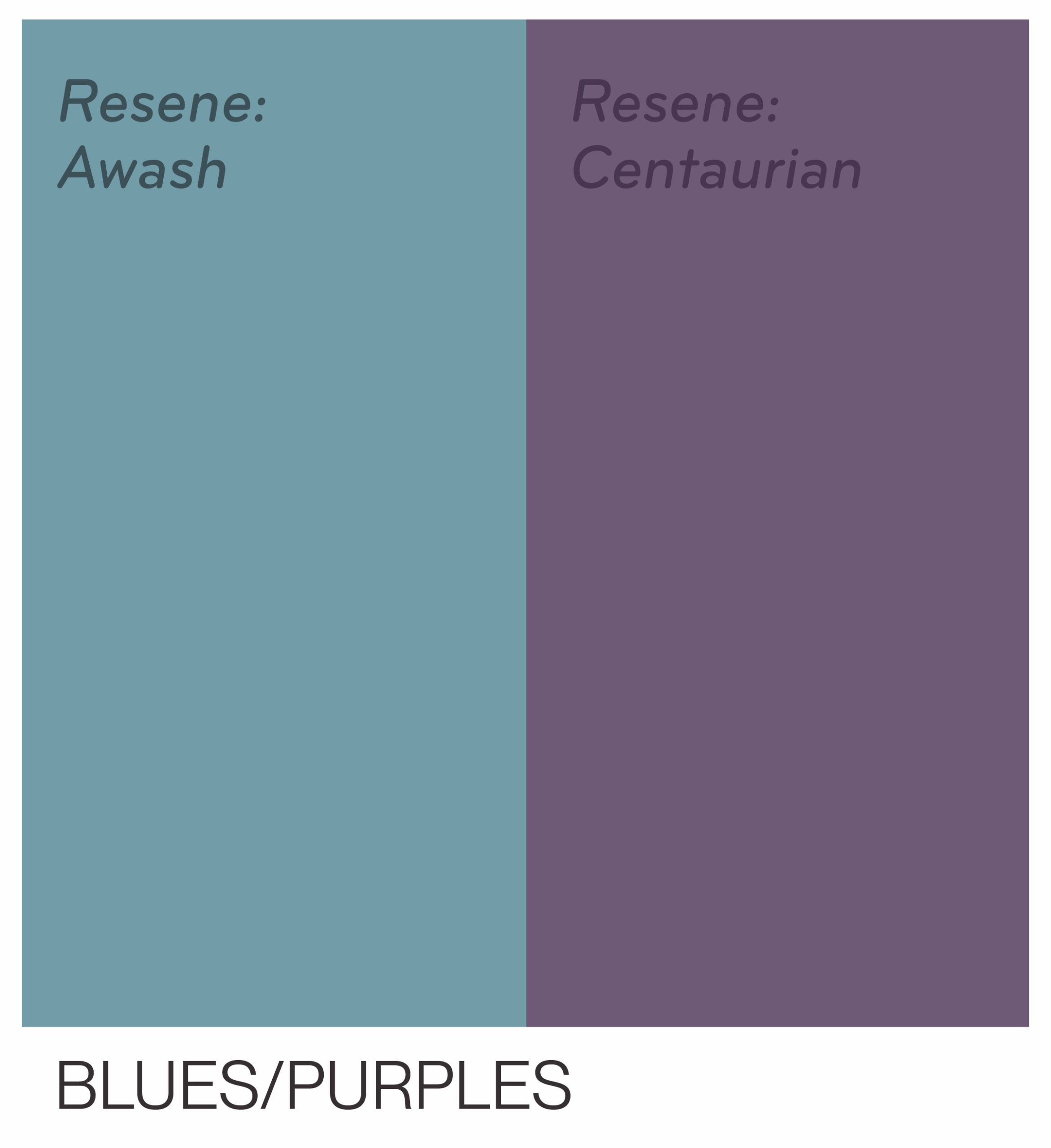
Blues and purples are scientifically proven to be calming and focus-driving, there’s a reason why many sites have blue accents and colour-schemes, as it improves focus and memory.
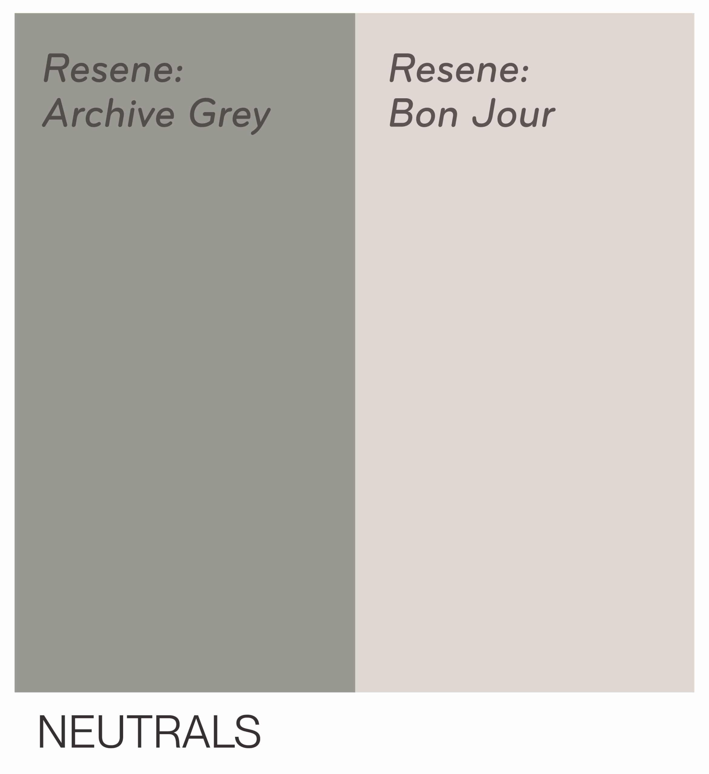
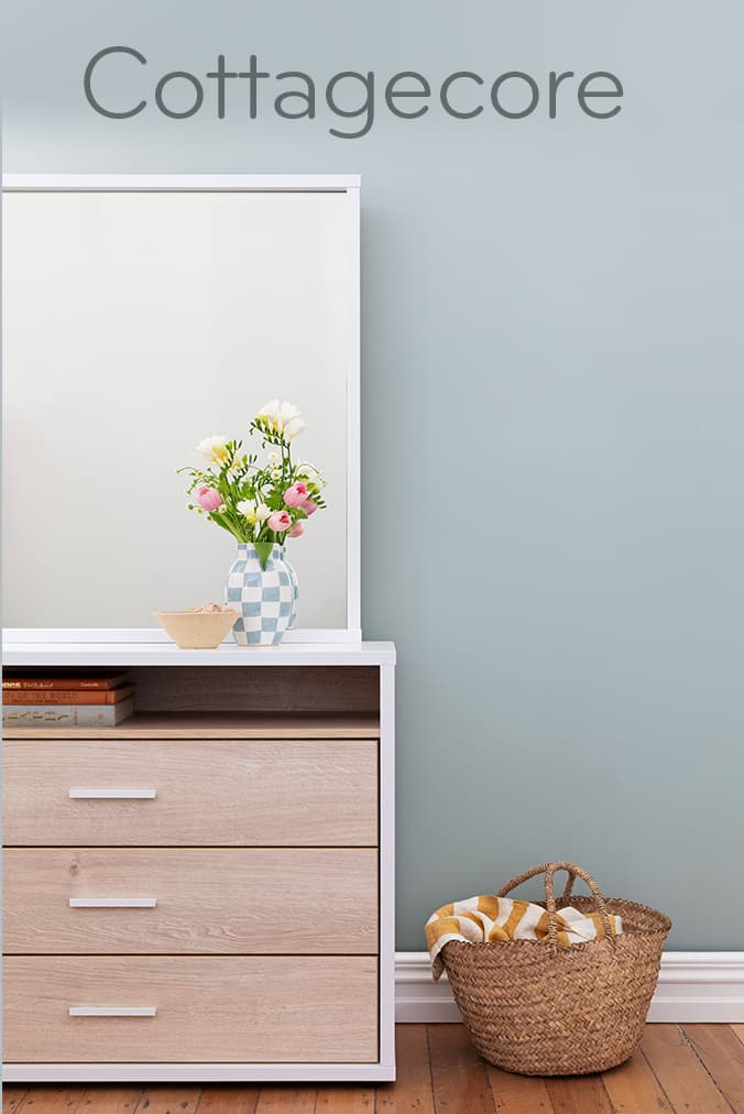
Neutrals are just that, neutral, soft beiges, whites and browns are easy on the eyes and the brain, and can make a perfect backdrop for more sophisticated décor, they’re also a great go-to for when you’re just not sure. Chose a soft neutral, or make it a warmer more mid-tone neutral, if you’re uncertain, it’s hard to go wrong.
While doing this, make sure you’re keeping in mind what furniture you’re going to be getting – or if you’ve already purchased, keep making comparisons, bring swatches home, put them beside one another, and try to envision the whole room in that colour.
While you’re doing so, consider getting test pots of paint, and making a swatch on the wall, test different lights, different times of day. Consider the temperature of light in your room, is it a stark, bright white? Or a warmer yellowish one? Also important to consider is the positioning of your room. Do you get more afternoon sun, or is your room lightest in the morning?
Quantity of colour, texture and shades are important to consider too here are some basic guidelines that can help when you’re a little lost:
Three Rules of Thumb:
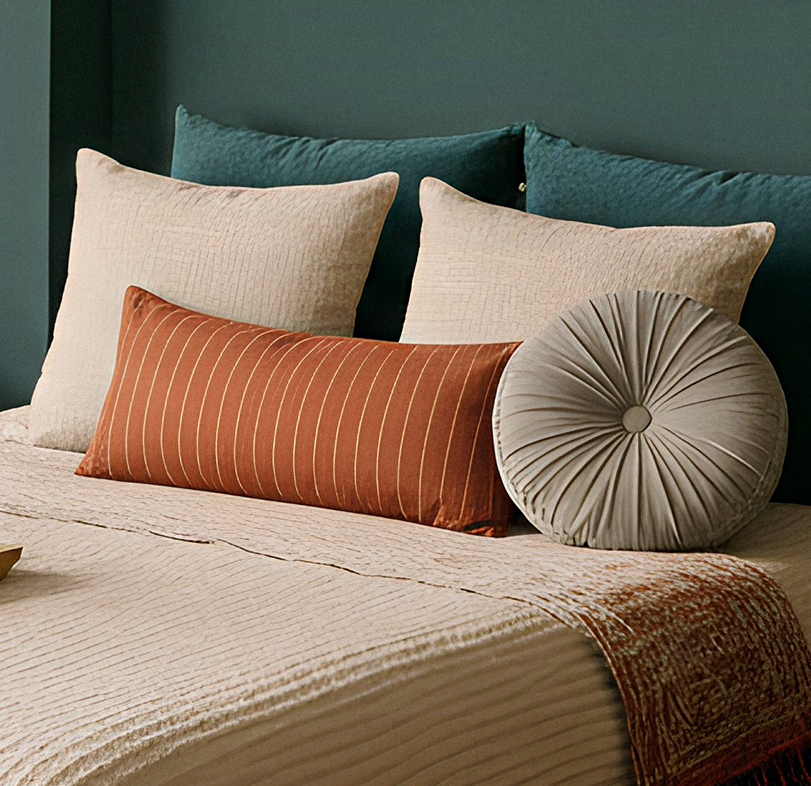
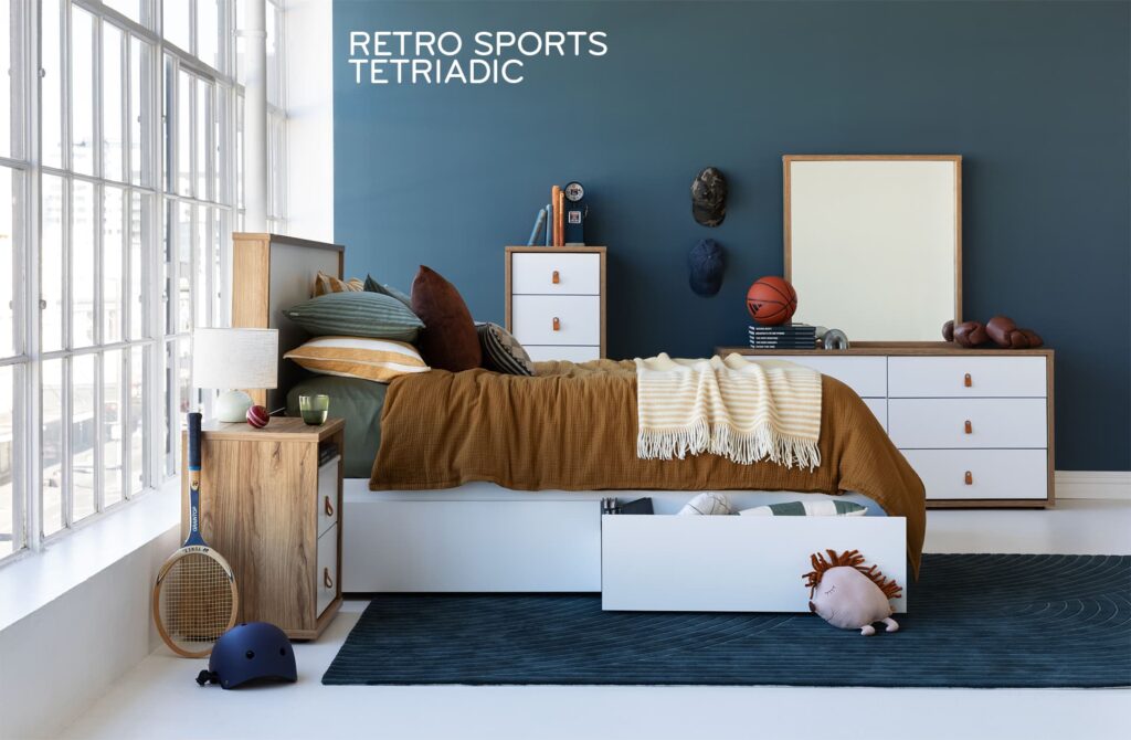
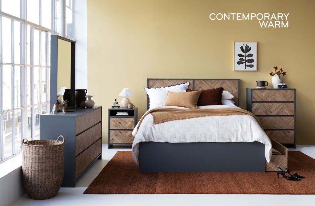
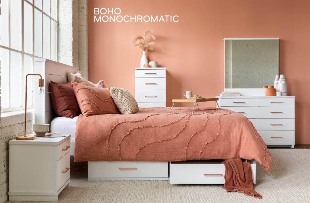
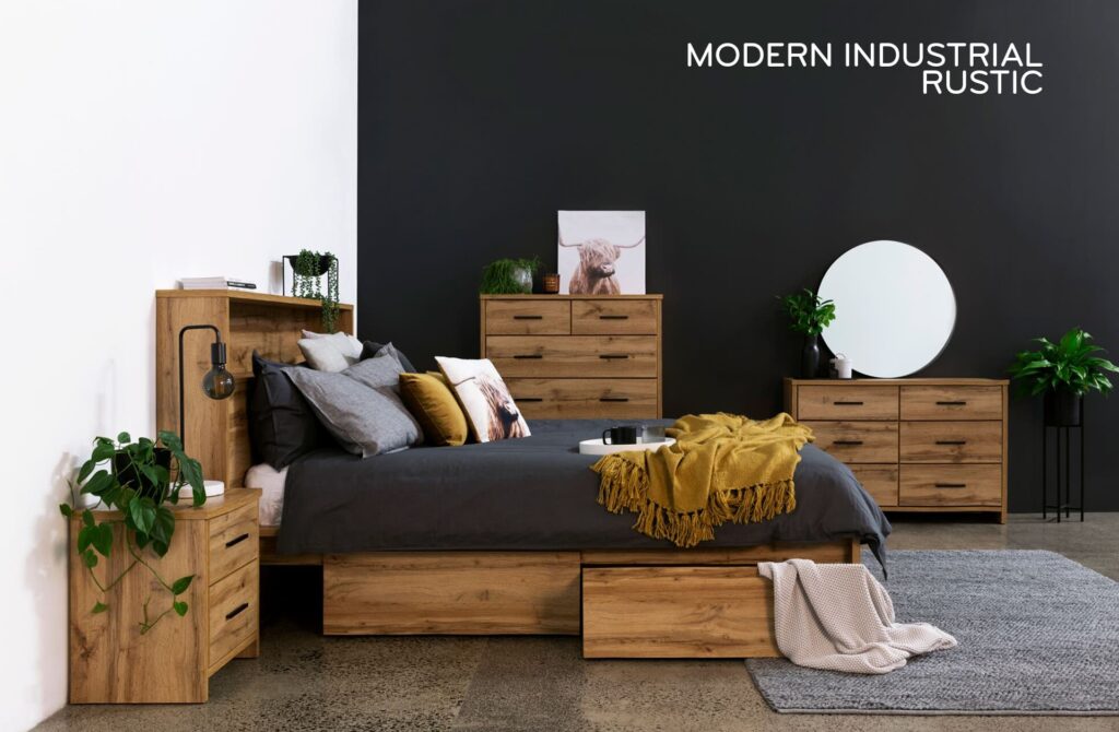
⚖️ Match contrast to your style: If you love bold, eclectic vibes, you might enjoy high-contrast combos (like black and white, or teal walls with orange pillows). If you prefer a tranquil or minimalist bedroom, aim for lower contrast – say, soft beige walls with ivory and taupe bedding – to create a gentle, cohesive ambiance. There’s no wrong choice, but the contrast level should align with the mood you want.
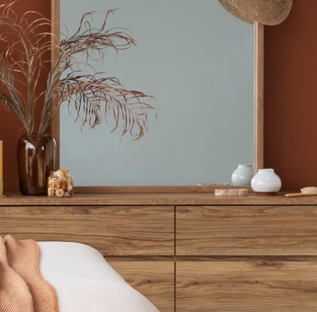
📏 60-30-10 Rule: A timeless guideline for balance is to use ~60% of a dominant color, 30% of a secondary color, and 10% of an accent color. For example, your walls might be the 60% (dominant neutral), your furniture/upholstery 30% (a complementary or secondary hue), and decor accents 10% (a pop of bold color). This ensures no single color overwhelms.
🎨 Limit Your Palette: Avoid using too many disparate colors in one room. Sticking to about three main colors (a neutral base, a richer second color, and one accent) helps maintain a cohesive, pleasing look. In a bedroom, that could be dark forest green walls, dark walnut furniture or drapes, and touches of gold or coral as an accent. This “rule of three” keeps the design focused and timeless.